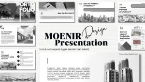

You are currently viewing Megzine Designing: The Secret Behind Great Graphic Design

Megzine Designing: The Secret Behind Great Graphic Design

https://images.openai.com/static-rsc-4/WChAItohHhnVS_W6hhXK2X30R28W0su9dInB-LM2kftR0gMBw-m9lYbzSUqyAKgVcJlMEa4-3Db8d8vzHdpVeph1fcDWDJPmF45aCNL3CdQaOhe7dDJ6dLb4cJjC5fWXE041mKSLxwYNK7Vv5Taio8EQ2T4VQfl9qwtBmk1XuNMY4VBKMmWjc6tkxiZj9G8e?purpose=fullsize
https://images.openai.com/static-rsc-4/euQSNBZkahEchPtcNlGo8mGlVtAdy0rTQ88cDHArbObRfVEdRTTxtg2l-tNJ4pIU4zKIvJXhlJa8kOizcT0dr0ULaaz1NjyelLuuYUq-sOcoDFGZP3dI7DRHmHdJSTuXRalhl3OkC0UFCwiTrQVD9xDALZ5qYdJihVqFbyqVUKLST7kgfAekcwrp8SDvGRld?purpose=fullsize

Introduction

When people think about graphic design, they often focus on colors, images, and layouts. However, one of the most powerful elements of design is typography. Typography is the art of arranging text in a way that makes it both visually appealing and easy to read. Great typography can transform a simple message into a memorable experience. Whether it is a logo, website, advertisement, or social media post, the right typography helps communicate ideas clearly and effectively.


Why Typography Matters

https://images.openai.com/static-rsc-4/fI_n6Ue5ZxKTlgVVJdUr2O97HPGEmmfzXxk5pTkeRaxSaLNzKKiGAJ-ecj_OJ6joJO-B_PWRhLhtN0N9J9leY0gIyhWbFxIll1m4QCAjBcWSE3ekOUL_PYpcylTys7CFL0PIfrJiMH2eEw9s7ZNLud4XFII8eVDvqXgntSfmwLPiktKX8e9aJnatEGz0KPE7?purpose=fullsize
https://images.openai.com/static-rsc-4/4PCEOEpDvNxL3IxD2WB6ehNREuIohyCPuAU7cyuZ3AzzA_AlYxxeVpoodq0aMuUntbMq2ihdxVWUX23m-1X8RPoH4dn1iPNGR4ROgWEohNQ39wVsPhL2PioTTq_vV1l1Nm0HslpGXfAS34Gcye6gGyBFAO9_Z6SOba9ib3-y-MruoIGICpKg2CZNkE9D1eYJ?purpose=fullsize

Typography is more than choosing a beautiful font. It influences how people perceive a brand and how they understand information. A well-designed typographic layout improves readability, creates visual hierarchy, and guides the reader through the content. Strong typography helps businesses appear professional and trustworthy while making content more engaging for audiences.


Choosing the Right Font

https://images.openai.com/static-rsc-4/C9yvU7lDRzm8i40WoxuOUwHSMHY4YyY0NJ6uYtOOT-q9wtb8yKa3QDqhBKrwWjEs_bzQfLwVfktHmAhXTaKRSORa3igoxLqWvqipM09SY6xyIfc_fMFeNgDZ6J438P6oZu65XF2JKoKY21c9BWxMdD7POM9c7Cfo2I6zX6uTyf_Q476w46P4HAxRZc9Hms_p?purpose=fullsize
https://images.openai.com/static-rsc-4/R1SQc3ogPtbLhV2CYgCTxmFlIpj0tfveoc9foOR-IlThhkL3c1eSSPQelKxRhJ9S2aRHRPW28Tss94YetTR6A2C0tAZVqdcFmNsqRVzfQi3ZTCNv68ihPRPkC0Rl4L4R8ZUukj4T07V0ZOu5WQY6WfQMrrb6_WIzoFb9tznM_WjIXySznb7HmCLytqrSuW1B?purpose=fullsize

Every font has its own personality. Serif fonts often feel traditional and professional, while sans-serif fonts appear modern and clean. Script fonts can add elegance, and display fonts create bold visual impact. Designers carefully select fonts based on the message they want to communicate. Choosing the right typeface is one of the most important decisions in any design project.


Creating Visual Hierarchy

https://images.openai.com/static-rsc-4/91yXBZqT69qv6vJVrHHgjQbu62ROokgi972Im9lOTrhxiRMFJr20PPkTBokn9eP0sSIRC2Xy6AsLz6UykVC7SATofQy-TywSoAxuCmvHCWFjskC00-VH_7jbk7M27Rzdu69m9sEvavL9W8Na9ZJLXecPTVzTgEz1_MYg0ipDEOvVw5tEW0qgC2gYYzLVwBQj?purpose=fullsize
https://images.openai.com/static-rsc-4/zyoSuGNE9sDBJBYdXIgqyuiAWgQAO0eJtHZC3ep1JX3ExsH5MVdEGJiKk_tEEzs8ZqLWR6dR5DWGsK9Cu8MW4esbxpwUbNhIWZc0Np5tprN67JkgXu-TyU2VcJ3G3zgwzyFoIVacgCszTBryslLc7LqBR9_nkljYWba3fQCIZVqFtDqBrFxKbQBP1xZw64SL?purpose=fullsize

Visual hierarchy helps readers know where to look first. Designers use different font sizes, weights, and spacing to organize information. Headlines attract attention, subheadings guide readers through sections, and body text delivers detailed information. A strong hierarchy makes content easier to understand and more enjoyable to read.


The Power of White Space

https://images.openai.com/static-rsc-4/k0-Z9JiqnAgOJXbXXURiUZ6ImqbHlMTPZefsgRf1vXygty-RenQhlNRDsRlr85HLWBPtJvgTSnqmgGcYzAlPThpfu1uMv0pwk7MNuIJtB1wwpecAHt-qVLdvj2ktKAPSzQahy156_Yr64lflGZKXSe4BKxxH3FRsm-hMbhgEEPrSmhex082h4h8eMTQxkliT?purpose=fullsize

White space, often called negative space, is an essential part of typography. It gives text room to breathe and prevents designs from feeling crowded. Proper spacing between letters, words, and paragraphs improves readability and creates a more professional appearance. Many of the world’s best designs rely on simplicity and effective use of white space.


Typography in Branding

https://images.openai.com/static-rsc-4/Gb-bUEfgdsYlUw-5SxLpqCMFWwy0oOTY9DKbIUh0yB5accWTJTtKHrEChtqxeGxZmO6kLKW1p23fGU2Hpo0jzVVK8o7nQSHXNRDCnJm4ZsFcEEvD4eTQhfD8aXM6g1kwisFUeCyT6IiYgpM95UuuMdBgZkYO-mNrhPmy1Prtpl_arfJfAnvhX6F1PW5Rlc44?purpose=fullsize
https://images.openai.com/static-rsc-4/yKM4xZsViDkbnd2DetqPQrg3T14AiLx7rLZHa66DahrPwh_AcyUwB54FsI8ZDN9fDCiVNElNw8mu5UNwDROg3Jm6dc0ihBt7Gdq2WELlrQREESGgMBaTujYETDI5yqLB_w0xztJuUpRnXthger0BVjg9on0KsoI1HIWDNdIM6FiXf2HK4S4jkZdftHLwoXqO?purpose=fullsize

Many successful brands are instantly recognizable because of their typography. The style of text used in a logo or marketing campaign helps create a unique identity. Consistent typography across websites, advertisements, and social media strengthens brand recognition and builds trust with customers.


Typography Trends in 2026

https://images.openai.com/static-rsc-4/LA1zgzCfK_hmo5wOv9i76KtzH1s5WpNwPkw9AfYUUGwnysF2ScR03rKXZjVGTOvMPvcAruPzUZB6GggFiCiwuj4IeUyP9na-mEAZvmdrVGQcxuASKKXb7lecYOjZgdl_ivYRldCesgmpQ1t_T1ArlQ8GUZXpsO6nEIrVmwZ-v2jT-0kq-vu-EdKetMivBx5i?purpose=fullsize
https://images.openai.com/static-rsc-4/39svS-w9XMfrtvFVWUHMf30hr9XQDn6tx8axqf-J28hMYjUZaJGcdlK1dZwSLZM59aUJh9BrFgicgUHhd_2EnIQFWutPnYsU_X3jPmU8Q-Dc1ccKs0gC1wX9NtGv5WZJzLCakLjDafT67L2ki5iOC0hLUYRRixYLlVftV8X912JjMmfzeVOCaBWi544hivWq?purpose=fullsize

Leave a Reply